Documentation
Emirates NBD, October 2022
— Backstory
— 32 “Help requests” per day
— 5 reasons that led to the problem
— What did we document?
— Who is it for?
— What tools did we use?
— How did we do it?
— Notion & Figma combination
— Results
Team
— Paul Waked (Project Lead)
— Renan Berco (Product Designer)
Backstory
The decision has been made to re-design the interface for Everyday Banking mobile and web apps. However, the new design system was provided by an external agency without any proper documentation.
The re-skinning project faced a series of challenges specially during the early days. There were misalignments across the team, uncertainties surrounding decision-making processes, differences in expectations, and a growing sense of frustration and ambiguity.
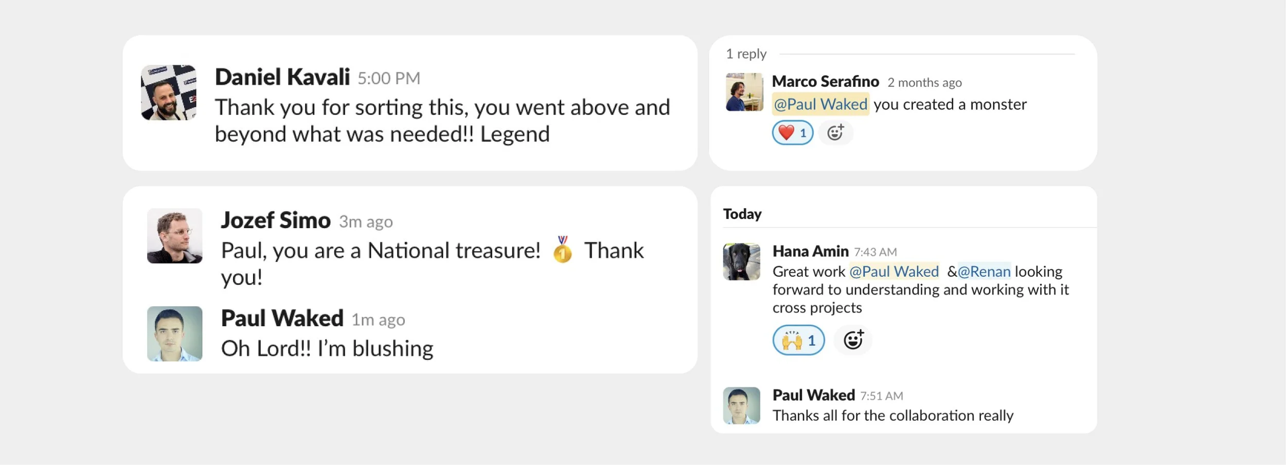
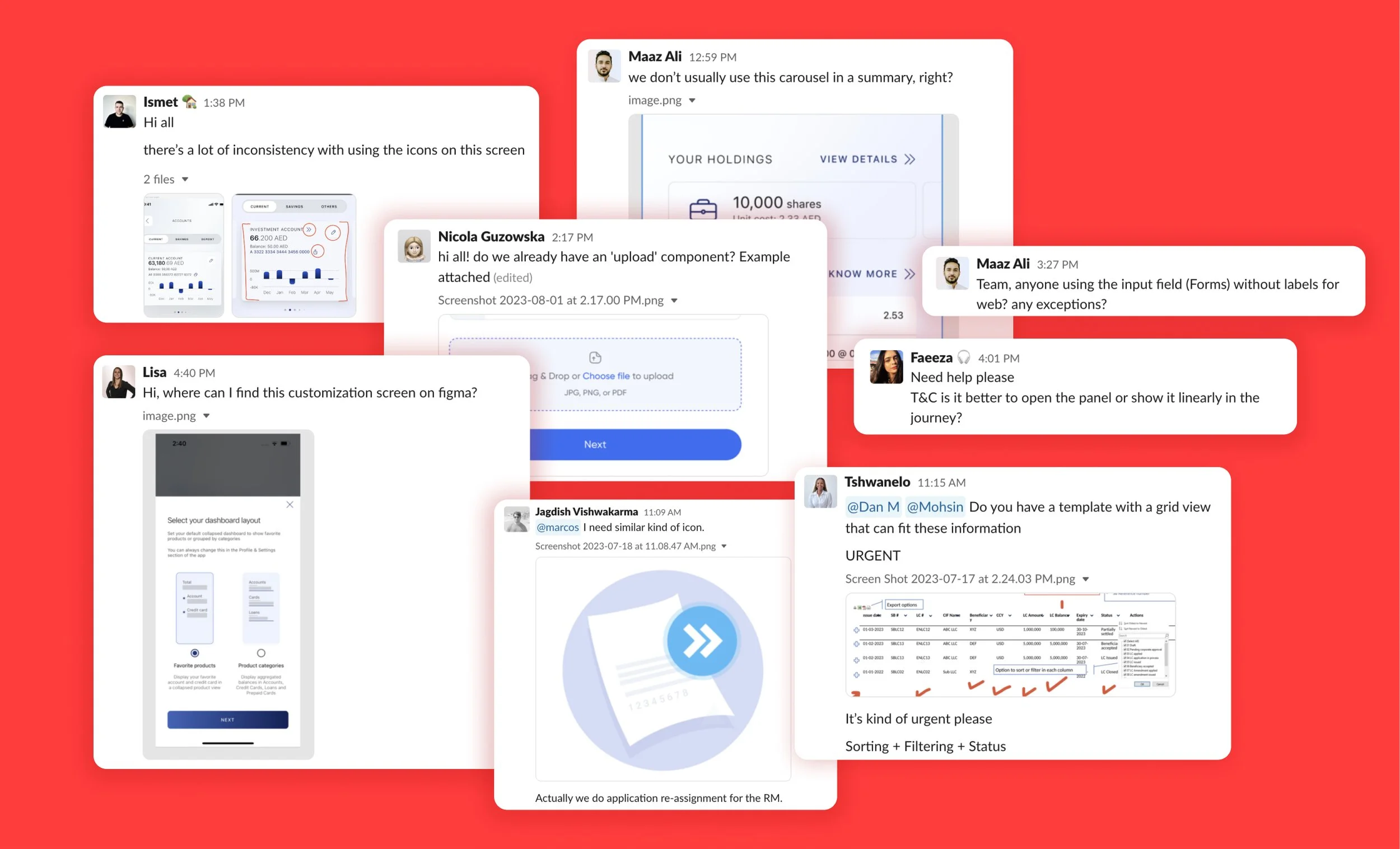
32 help requests per day
During the initial weeks of the reskin kick-off, an average of 32 help requests were received per day from the designers on the #help Slack channel.
We even experienced an influx of over 60 requests of various kinds, such as "inconsistency," "difficulty finding a template," "queries about interaction in specific cases," and so forth...
5 reasons that led to the problem
No Previous Documentation
Lack of design documentation of the previous design
External Agency
The new foundation of the Design System (new skin) was designed by an external agency
3 Months Timeframe
We were given 3 months to re-design all the journeys that were designed over the past 36 months (3 years)
6 to 16 Designers
The design team grew from 6 to 16 in less than 5 weeks
Fast Onboarding
Some designers didn't go through proper onboarding; as a result, many of them started designing without a proper understanding of the logic behind most of the interaction and visual patterns
What did we document?
We had to act quickly, so we identified three main areas where designers were struggling based on their messages requesting help on Slack:

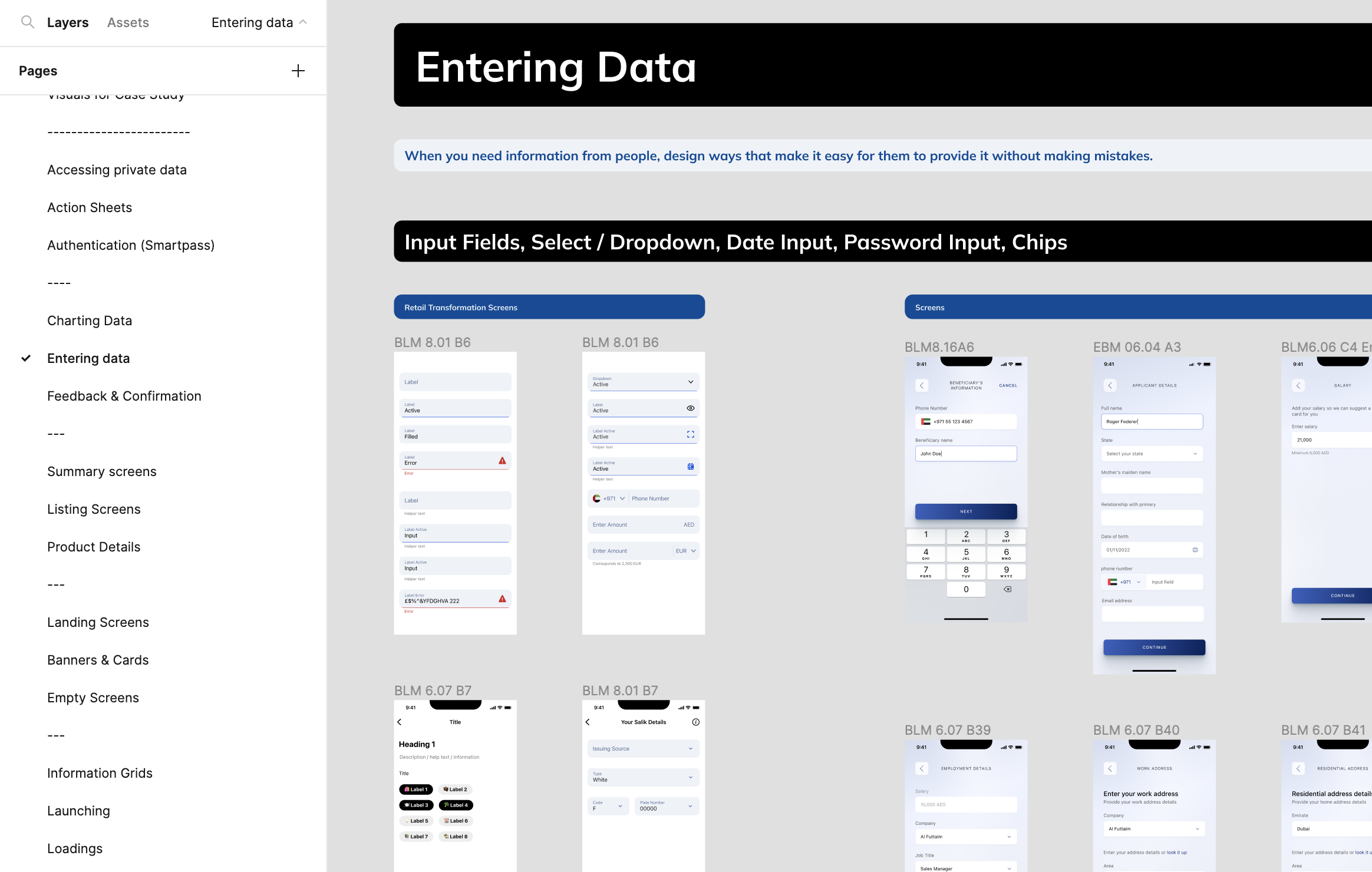
Common Interaction Patterns
Why, when and how to use common interaction patterns such as Panel Sheets, Lists with adding new records, Feedback banners and many more.
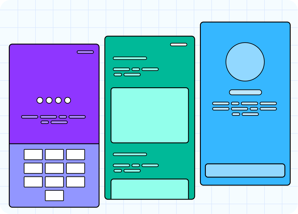
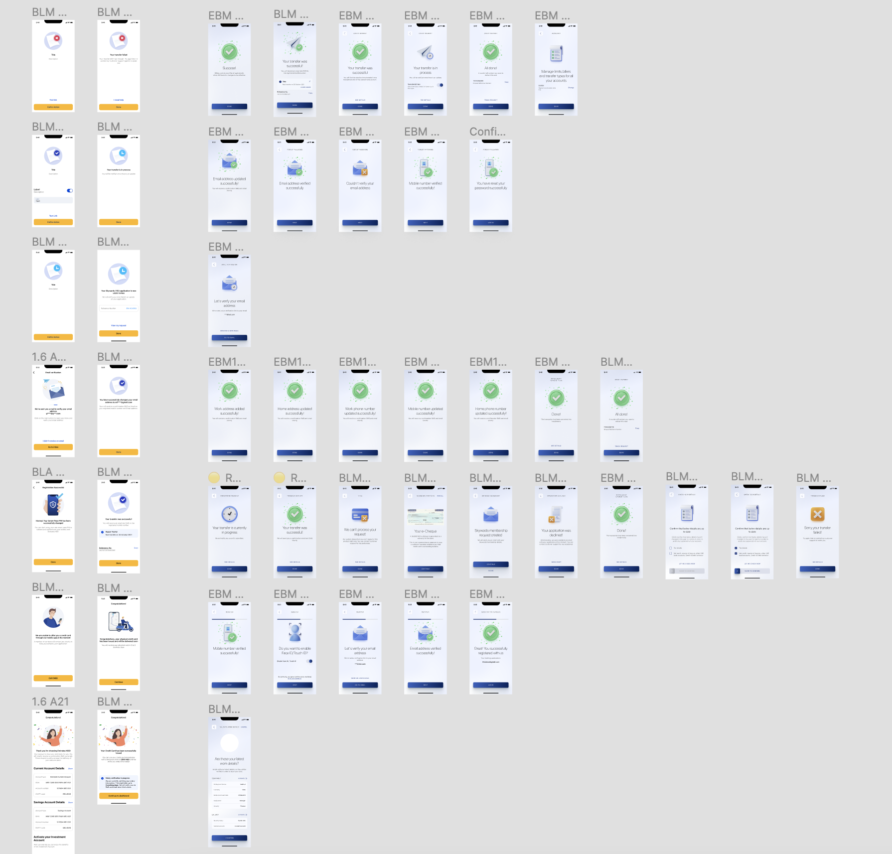
Common Screens
Screen we used frequently such as SmartPass, Feedback Screens, Summary screens.
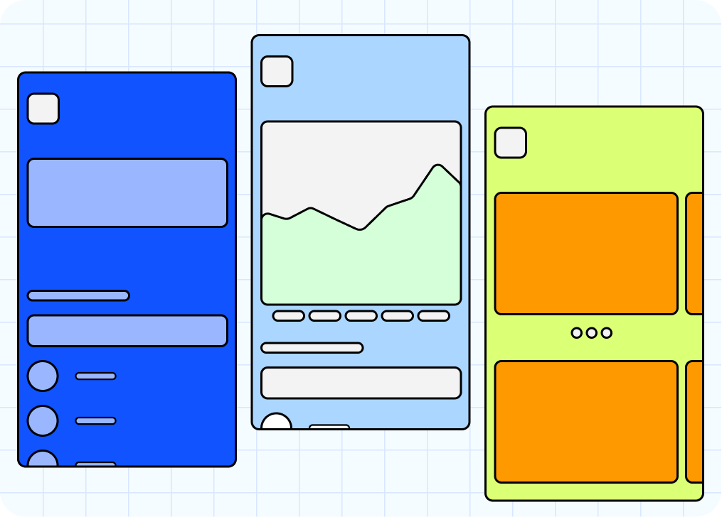
Single-use Screens
Screens that don’t appear in each flow, but when used, spacing was applied in different ways.
Who is it for?
Designers
Experience, Interface and Design System
UI Engineers
iOS, Android, Front-end developers
Stakeholders
Product Owners, Solution Architects, Backend Developers, Scrum Masters
What tools did we use?
For displaying templates, components and embedded URL within Notion
Figma
The search functionality in Notion is advanced and has greatly helped new joiners find things faster. It has also assisted in making informed decisions and tracking minutes of every meeting.
Notion
We created a documentation channel to share updates, facilitate ongoing conversations, and respond to help requests.
Slack
How did we do it? In 6 steps
1 - Old vs New
All re-designed screens were listed side-by-side with their corresponding old designs.
2 - Identified Patterns
We identified all patterns, created pages on Figma, and mapped all the screens we listed in step 1. Our main references were HIG (by Apple), Material Design (by Google), and Carbon Design System (by IBM).
3 - Rounds of 3 Categories
We created groups, each with 3 categories, and asked the designer to go through each group in rounds of 9. Subsequently, we created a Notion table to track which category is completed and who revisited it.

4 - Auditing Rounds
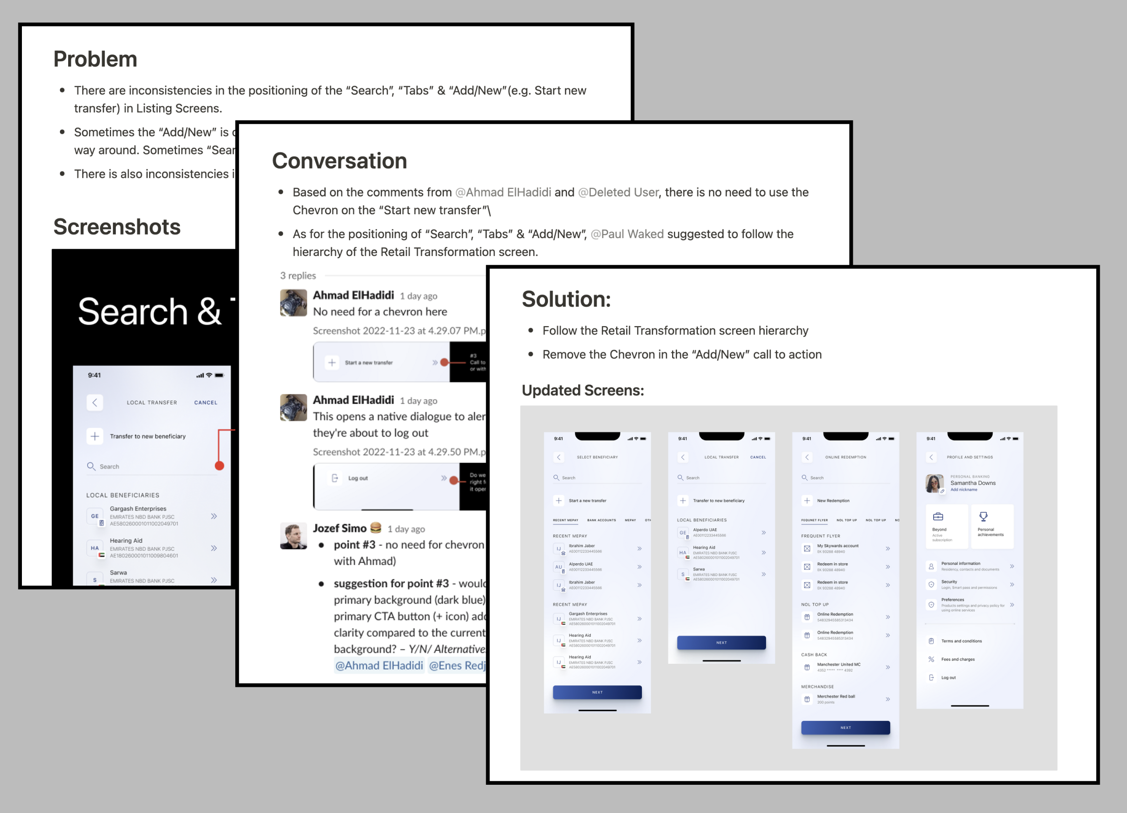
When every category is marked as 'checked,' we ran an auditing session to identify any inconsistencies between the screens posted by each designer. We then scheduled a quick call or dropped a message on Slack to fix them.

5 - Polished Version
Once the alignment and discussions are over, we created a polished (pixel-perfect) version of the screen with a wirefram.

6 - Proof
We create a “Meeting & Agreements” page on notion to save every conversation as proof of the final decision. We created the following format: The Problem, The Conversation, The Solution
Powerful combination Notion and Figma
We mirrored the same categories that were created in Figma on Notion. Then, we used the embedded URL frame feature to preview the Figma pages within Notion, along with an explanation of How, When, and Why we use each screen.

The results
The number of help requests per day began to decline as soon as we shared the structure on Notion along with instructions on how to utilize it. Below, you'll find some of the wonderful feedback we received from our designers, leads, and managers: